Better?
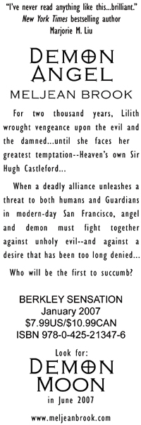
The title twice, my name and site, most of the book cover… and I tried to make the color scheme fit the cover a little better. Whaddya think? (The back of the bookmark will have a little more info, like ISBN and purchasing, and a little shout-out about Demon Moon.)

Without the drop shadow:

the back:
What I wish I could do:
