Cover stuff and chest hair
First: I should have Gobsmacked winner announcement up soon! I am still getting my head on straight today.
Second: I was over at VampFanGirl’s Guardian extravaganza (today is Wild Thing!) and some Nathan Kamp love came up in the comments. I’ve had my share of pretty Kamp covers (and no one is sure if the Demon Angel cover is him or not), but I also realized that one thing readers don’t often see is the hi-res versions of these covers. The reason is simple: they just take too long to load on the web and too much file space on a site. But it also means that we miss some details.
I’ve got a couple of large images under the cut. My apologies to everyone on Google Reader and RSS feeds — it will probably load the images, because the cut never works, except here on my blog.
So, first — I think Kamp is a pretty, pretty man, but what made this cover for me the first time I saw it was what the art department did to his eyes. They pumped up the color so that they are just stunning:
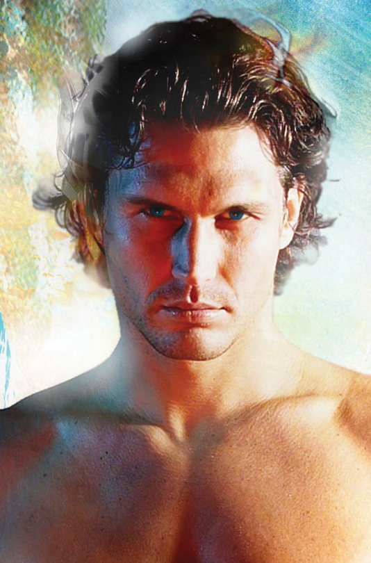
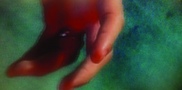
But you don’t really see them that well when the cover is in your hands. (And you don’t really see his hands, either — he’s wearing a wedding ring, which I think is just the sweetest, sexiest detail on this cover.)
You can easily see that his chest is hairless, even in low-res versions. I forgot to mention this when this topic came up at True Romance last week, though I was thinking about it. I don’t mind chest hair at all, but I do think it looks scraggly on a cover. For example, here is a close up of an early version of the Hot Spell cover (also N. Kamp):
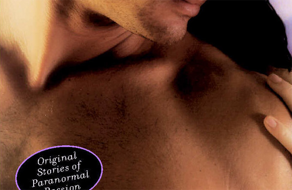
You can see the hair which — although I imagine it isn’t so scraggly in person — looks pretty much like stubble here. It just doesn’t show up well in the pictures. So of course they go in and remove it (and paint her nails. The cover was also in a lavender color scheme, which was pretty, but I think the dark blue they eventually used was much better suited to the anthology):
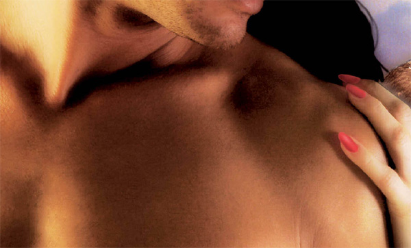
Stubble on his jaw? Good. Stubble on his chest? Not so good.
Then, of course, there’s the cover of Demon Night. I love this cover a lot, and yes, it doesn’t really make sense that he’s wearing a jacket without a shirt, but they did leave the chest hair on to keep him nice and warm…and this time, it doesn’t look so bad (especially at a lower resolution 😉 ). Is it just the difference in lighting? Maybe Kamp’s natural chest hair isn’t as, um, bountiful, and this model’s just happened to avoid the scraggle? Not sure. But I’m glad they kept it, even though I’m not really a fan of it on most covers. But in this case, it gave him a touch of roughness to balance out that pretty, pretty, pretty, pretty (not Nathan Kamp, though) face.
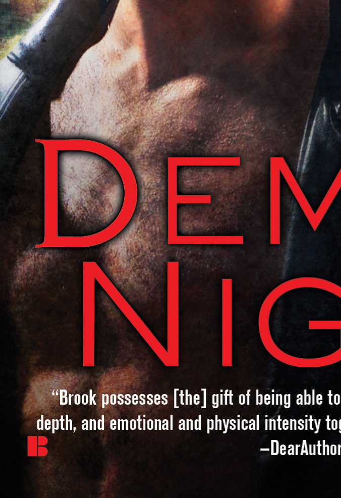
And, this is where I leave you: With a shot of a giant, hair-covered chest. Never say I didn’t do anything to for you.

