Vote!
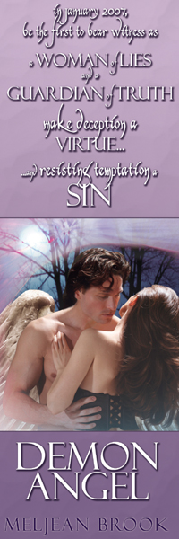
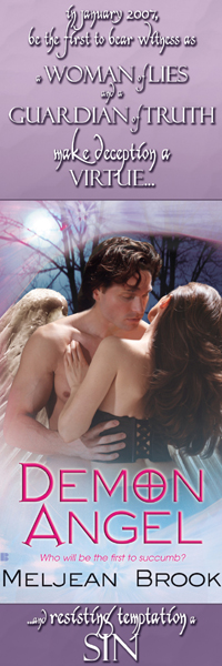
So these are two very preliminary versions of bookmarks that I might send to a printer — the size is 2×6 inches, and would go to booksellers. Which one do you like better? And, do you have any suggestions? Should I crop the photo more? Is the one with the entire cover better, do you think, for marketing purposes (the crossed-O in demon is going to be a regular thing, so should I use it? I’m just having a hard time matching the other font to it (the O, D, and A are all Avalon Quest, but I’m not sure of the others, though I’ve looked all over the place.) The lavender is because the book cover is lavender, and the font is kind of frilly because bookmarks always strike me as frilly. But is it too much?
Hmm, and maybe I should ask my editor if I can get the original artwork without the text, since that is difficult to work around. Duh, and they could tell me the font used, too.
The back of the bookmarks will be black and white, and contain all pertinent release info such as price, ISBN, a very brief blurb, my website, and that DEMON MOON is coming up in June. Oh, and the quote from Marjorie Liu that says the book is brilliant 🙂
#1

Or #2


